Why use Option Sets for menus?
There are several reasons for why you should create a menu using Option Sets. App performance is one of them: building a menu structure in a Repeating Group instead of in separate regular Groups is a lighter way to build, and using Option Sets instead of the database reduces the loading time and allows the data to be fetched from Cloudflare‘s CDN instead of Bubble’s servers.
The method in this tutorial also gives you a an easy “menu editor” on your Option Sets that let you easily add and reorder new menu options as needed. We’ll be referencing the Option Sets both in the menu, our URL parameters and on the Groups we want to show and hide, helping with app consistency. If we ever want to make changes to our menu options, the changes will instantly be available app-wide.
This tutorial requires some experience building with Bubble, and we’ll assume you know your way around the design editor and Bubble’s different group types.
In the example below, we’re setting up a structure for a potential blogging platform, and we’re setting it up as a Single Page Application, meaning that your Users will stay on the same page as they navigate. Let’s get into it:
Create a menu using Option Sets
The first thing we’ll do is to add the Option Sets that we need. We’re going to create two of them – one for the main navigation and one for sub navigation. Create the two, one called Navigation: Main and one called Navigation: Sub. Add the following fields:
The Main Menu
The main menu will contain our main navigation options.
| Field | Type | Purpose |
|---|---|---|
| Display | Text (built-in) | We’ll use this to store the URL parameter used for navigation |
| Label | Text | This is the text we’ll be showing in the menu |
| Sub-Options | Navigation: Sub (list) | This is the sub-options we’ll be showing under this option |
The Sub Menu
The purpose of the sub menu is to contain an additional level of options in our menu structure, like Users -> Admins. Set up the Option Set fields like this:
| Field | Type | Purpose |
|---|---|---|
| Display | Text (built-in) | We’ll use this to store the URL parameter used for navigation |
| Label | Text | This is the text we’ll be showing in the menu |
| Parent | Navigation: Main | This is the Parent option from the previous step |
Adding your menu options
With the option sets set up, let’s add some data to it. For our example here, we’re going to add a few main options, and some sub options:
| Main Option | Sub Option |
|---|---|
| users | |
| users | |
| admins | |
| content | |
| articles | |
| categories | |
| settings | |
| languages | |
| settings |
With that structure, your main menu option set should look like this:

Opening up the users main option should look like the image below:

Designing the menu
Next, we need to add the menu to the app. In this example, we’ll use a Floating Menu attached to the left side of the screen to create a sidebar. We always follow a grid of 25 pixels, so we’ll make that floating menu 200 pixels wide for now.
Setting up the groups
Next, do the following:
- Create a Repeating Group with a height of 100 pixels. This will contain both our main options and sub options.
Type of content: Navigation: Main
Data Source: All Navigation: Main - Create a regular Group inside of that Repeating Group at 50 pixels, and with a height of 50 pixels. This purpose of this group is to let us show and hide the sub options.
Type of Content: Navigation: Main
Data source: Current Cell’s Navigation: Main - Inside of the regular Group, create a second Repeating Group with a height of 50 pixels to display our list of sub options.
Type of Content: Navigation: Sub
Data Source: Current Cell’s Navigation Main’s Sub Options
Looking at your two repeating groups, they should look like this:
Adding the label text
We have a separate step for this part for a reason. One of our performance best practices is to avoid adding any more elements to your page than are needed, as it will bloat your app. In most cases, menu options are built as text elements inside of a bigger group element in order to make it a bigger clickable area. To reduce the number of elements (remember, they’re multiplying for each cell in your repeating group too!), we’re going to set up the text label to be bigger, and instead use styling to space it correctly.
Add a text element inside each of the Repeating Groups from the last step, and set that text to be 50 pixels high. This should make it cover its entire existing cell, to make that cell clickable. If you have a font size of 14, change your padding settings to the following to adjust the placement:
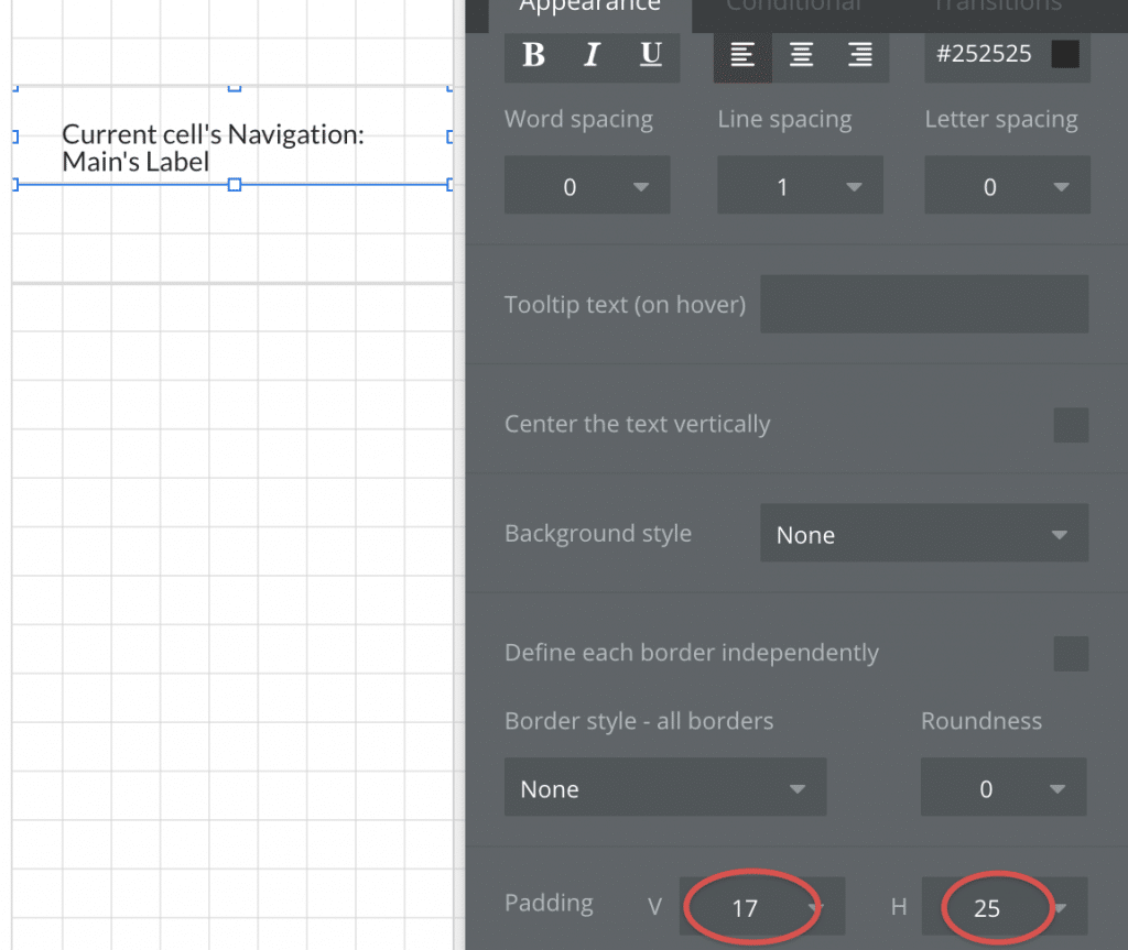
Set the text content to Current Cell’s Navigation: Main’s Label and repeat the step for the sub option, but set the Horizontal padding to 50 to indicate that it’s a sub option.
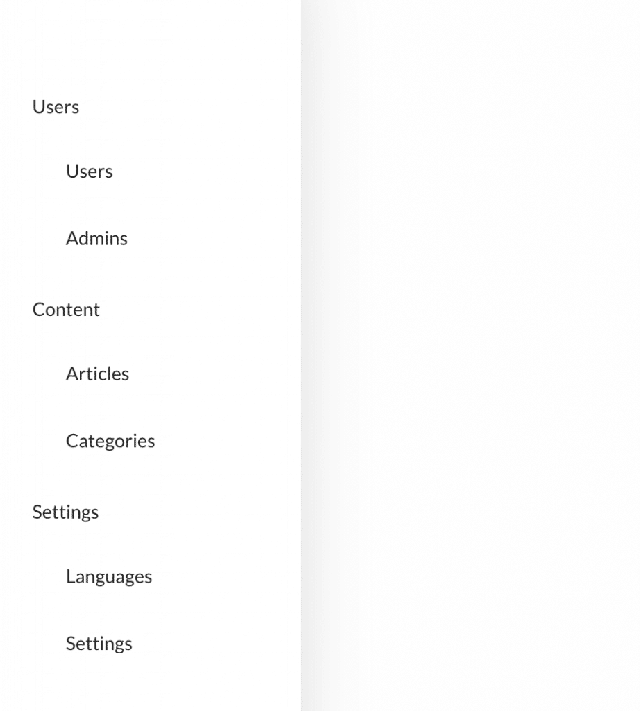
With that set up, let’s preview our app. You’ll now have a menu that looks something like this:
Setting up the navigation workflows
Now our menu still doesn’t do much except look nice and tidy. So let’s set up some workflows to actually help us navigate the app. For navigation, we always use URL parameters, as this allows your users to use the back button as they move around in your app and be taken back to where they just were rather than reloading the previous page. URL Parameters in Bubble are manipulated using the Go to page action, so that’s what we’ll use.
Navigation: Main
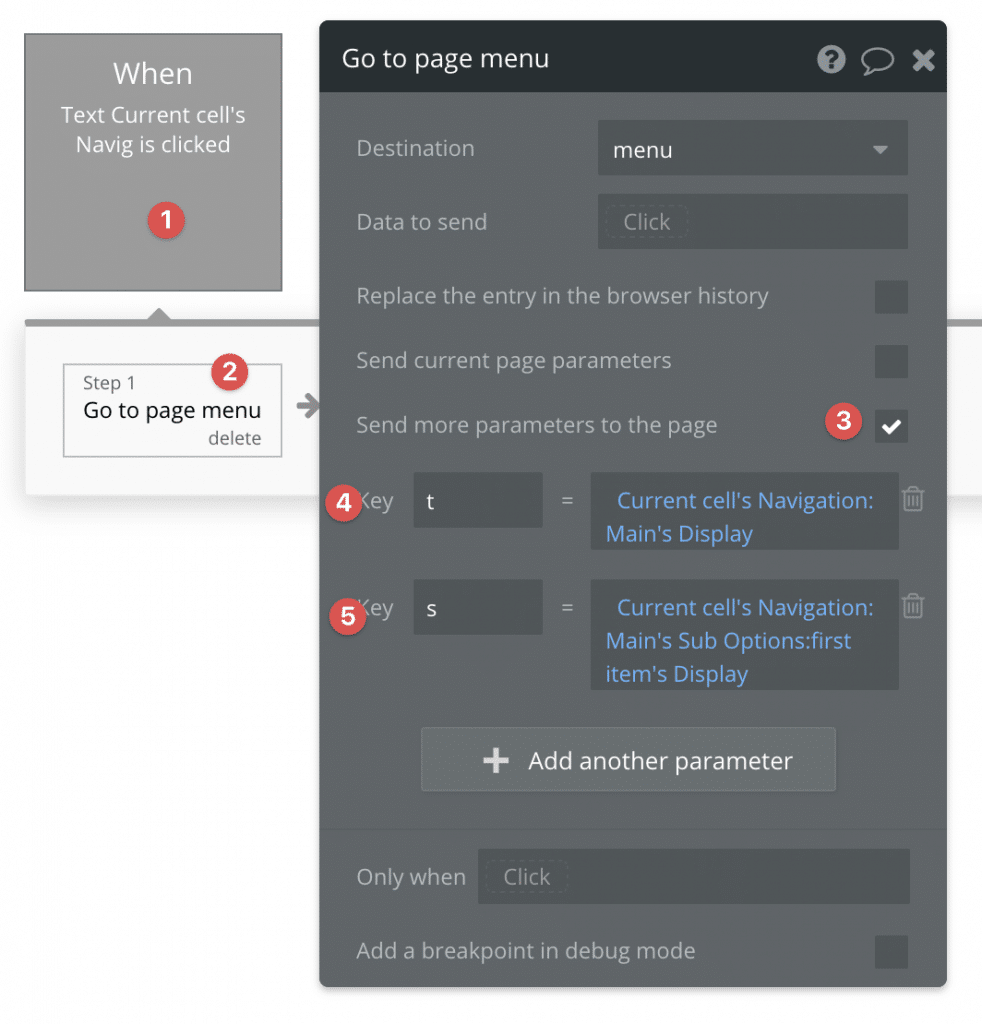
For our Main menu options, we’ll set up our action to automatically take us to the first available menu option within that option if clicked. Select the Label text in the Navigation: Main option and click Add/Edit workflow.
Set up the go to page as illustrated below. We usually name the URL parameters t (for tab) and s (for subtab), but you can give them whichever name you want.
Testing that action in your app should produce the following result in your browsers URL bar:

Navigation: Sub
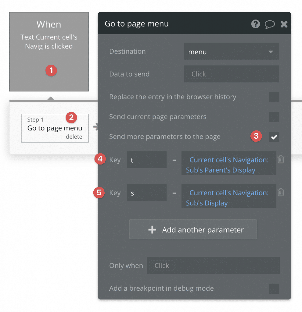
For the sub menu text, we’re going to do almost exactly the same thing, but with some key changes:
Setting up the conditions
Now, let’s set up the conditions to reflect the changes in navigation on the page. This part involves to steps:
- Showing/hiding the sub options in the sidebar menu as needed
- Showing the page content that we’re navigating too
Menu option
The behavior we’re looking for is for the sub option menu to be visible if its parent is currently active. The way we can tell this is by referencing the s parameter in our URL. Select the Group that contains the Repeating Group with the sub options in it.

Don’t forget to change the Group’s settings as well:
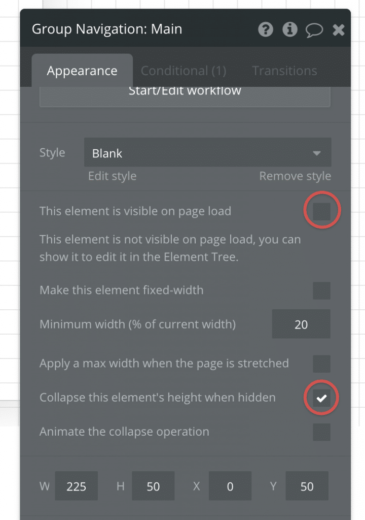
Using this same condition allows you to place any kind of styling you want on your currently selected menu options, and will also make sure the correct option is open if the page is reloaded with URL parameters intact.
Page content
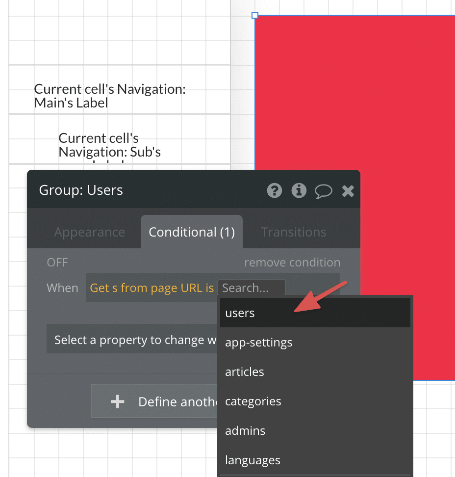
Now for the final part, let’s add the Group that we want to display content in accordance with the selected menu option. In this case we need to reference the s parameter instead. I’ve set a red background color to the content group to show it clearly, and notice the key changes in the condition:
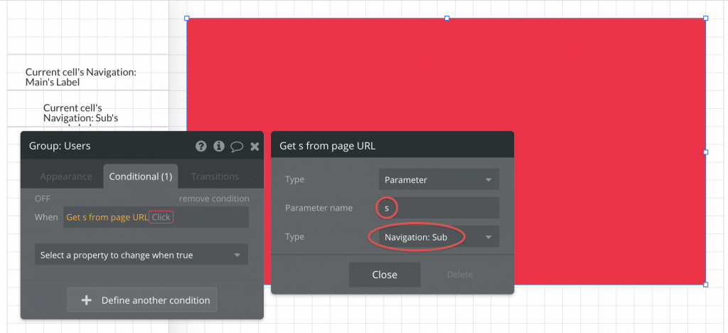
This is where we start seeing the strength in using Option Sets for navigation, since we can now reference the users value directly in our condition. We’re passing the same option from the menu, through the URL and to the final group we want to show: should we want to change the URL parameter, it will automatically update everywhere.
Conclusion
In just a few minutes, we’ve built a performance-friendly and dynamic menu that can easily be updated with new options and sub-options without touching the page design. Using Option Sets opens up for other creative uses as well, such as hiding and showing menu options based on the Current User’s admin privileges and redirecting them away from content they shouldn’t be able to access.
If you have questions or comments, let us know in the comment section below!




3 Comments
this is awesome! I wish I had implemented this sooner in some of my more complex apps. Luckily I’m redesigning one right now and this is what I needed to do (and will be doing from now on)@
Hey Petter,
This is great stuff. Could you do another how-to, step-by-step guide for “hiding and showing menu options based on the current user’s admin privileges and redirecting them away from content they shouldn’t be able to access”? manly the workflow behind that. I have heard of anther sid that you can run a workflow every time the URL chances and then run down the line of Prams in each section of the URL and look if the current user as the right to view the data. I have both of your books, and your content is so helpful. No-code people like me feel lost in many ways that you help with. Your content is like no other.
Hello,
Excellent resource! It really helped a lot.
The only issue I faced was, that when my options for my sub-menu had spaces values between words(e.g ”Product Types” or “User Groups “) it seems that the conditions were not working. Please, any advice how to fix that without to have to rename my options to single words?
Many thanks in advance
Keep it up:)