As you’re learning Bubble, one of the first things you’ll see are the Groups found in the Containers category on the left toolbar. They carry names like Repeating, Floating and Focus Group – but what exactly are the Bubble Groups used for? In this article, we’ll dive into what groups are in general, and then have a close look at each one. Let’s explore.

What are Bubble groups?
To understand Bubble Groups, you first have to understand the term elements. Everything that you place on the blank canvas that is your Bubble app is an element – text, buttons, images – or indeed groups.
Groups can contain other elements
So a group is in itself an element, but it’s different in one way: it’s the only element that can contain other elements. The group is known as a parent and every element inside of it is known as children.
This makes them different both in the editor and in your app. As you’ll notice in the editor, anytime you move a group, every element inside of that group will move along with it. In this way, groups make the editing of your app a lot easier, since you can group elements together and easily move, copy/paste or delete all of them at once.
You can place groups inside of each other in as many levels as you want, and you’ll notice in Bubble’s element tree that groups make up a hierarchy where you can see each element as part of its parent:
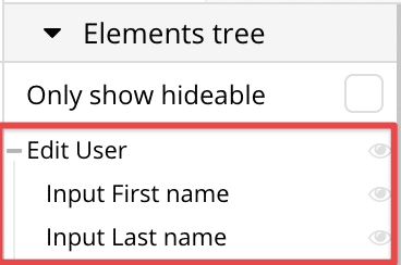
This let’s you quickly identify and navigate groups in your app. In the example above, we’ve named our group Edit User, and you can see it contains two input elements for first and last name. Clicking the eye symbol will hide any of the elements (including children) in the editor, but will not affect your app.
Groups can contain data
When you place a group on a page, you can also decide that this group should contain a specific kind of data, and every element inside of that group will inherit the data reference from it. That bit sounds a bit more complicated, so let’s look at an example to make it a bit more digestible.
Let’s say that you are setting up a form to change details one current logged in User, such as first name and last name. In that case, it makes sense to set up a group that has the data type User, to quickly allow elements inside of it to reference that user.
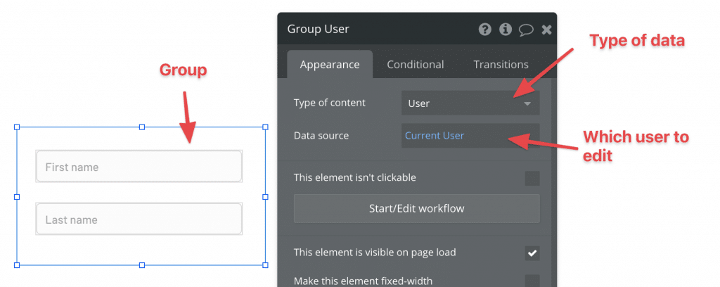
In the example above, we’ve set up a simple group with just the two fields that we want to be able to edit. Now, how does Bubble know which User to edit? This is where the Group comes in – we can tell Bubble that we want the group to contain a User, and in the next step we tell Bubble which one. In this case, we’d like to edit the currently logged in user – aka myself.
Note that Group’s Type of content can never change, but the Data Source can be a dynamic value or it can be changed with an action.
Because Bubble now knows that the Group should contain a User and which one, that information is automatically passed on to all the Group’s children element. Take a look at the illustration below:
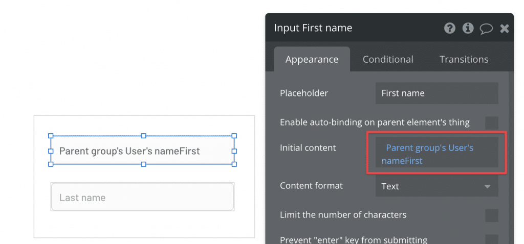
This is the quickest way to instruct Bubble which User to work on. In the example above, we’re fetching the first name of the User loaded into the Group – which we set to Current User in the last step.
You can load any kind of data into the Group this way – even a text value, number or Option Set. Sometimes it’s even practical to set up a group that’s invisible to your Users, just to store some kind of data in it.
Even though we illustrated it with a regular Group, this applies to all Group types. They can all contain specific data of a certain type, and child elements can reference it.
All types of Bubble Groups
Ok, so now that we know a little bit about how groups work in general, let’s have a look at each type and how they’re different.
Groups
The first type is the regular group. A group can be placed directly on the page, or inside of any other Group type. On the editor side, groups can be used to organize the content on your page, and to pass data (such as a User in the example above) to child elements.
Groups let you set up responsive settings efficiently
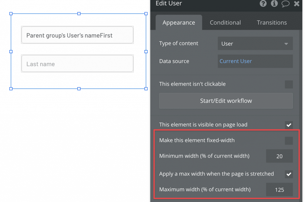
In your app, Groups are important in other ways. First, you can save your responsive settings directly on the group, instead of setting up each child element one by one. Responsive settings are any settings that you place on an element that concerns how it behaves as the screen size changes, such as how long it should maximally stretch or shrink. By placing these settings on the Group, you’re working more efficiently than having to edit each and every child element on its own.
Groups are collapsible
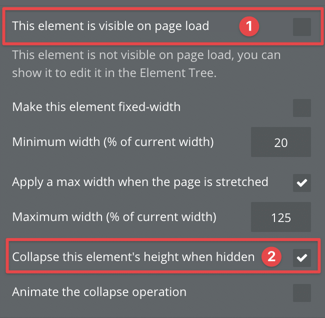
One of the most important features of the Group element, is that you can choose to collapse its height when it’s hidden. This means that whenever the Group is invisible in your app, its height will collapse to 0 pixels and any element underneath it will be pulled up the same amount of pixels as the Groups original height, thereby “replacing” it.
This is why you’ll see that many apps consist of Groups stacked on top of each other like a game of Tetris – this is how you build Single-Page navigation. As long as Groups are perfectly stacked on top of each other with no overlap, they’ll replace each others Y coordinate perfectly and instantly when a Groups is set to invisible and another one made visible.
Repeating Groups
Repeating Groups behave a bit differently than the rest of the group types. As the name suggests, a Repeating Group is basically a group that will render one row for each record in a list that you provide. As an example, think about Gmail – your inbox will be displayed with one row that represents each email conversation, and each one of those rows would be one cell of a Repeating Group.
The magic of the Repeating Group is that you only need to design the first row, and Bubble will display each cell with those elements repeated. So while a regular Group can contain information about one User, a Repeating Group can contain the info of a list of Users. Inside of each cell (or row), you can reference the single User from that specific row. Let’s again look at an example to make this easier to wrap your head around.

So what’s happening here?
- We’ve set the content type of the Repeating Group to User, and are searching for all registered Users.
- We’ve set the total number of cells to show to 4. You can see those rows on the right-hand side
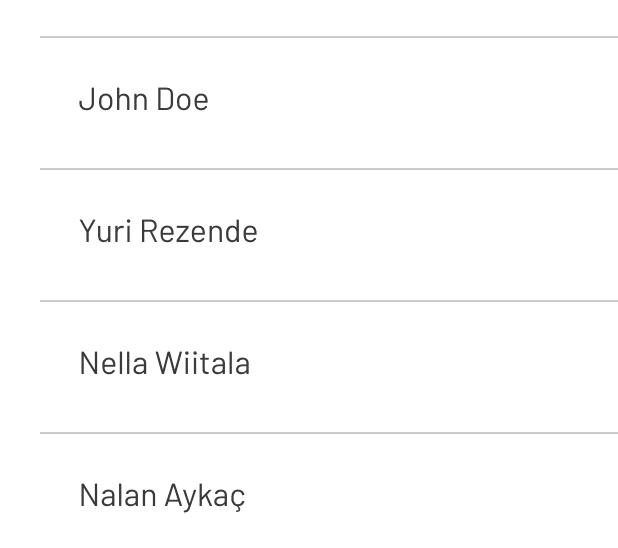
- I’ve placed a text element inside of the first cell. To show the name of the User on that row, I’m referencing the Current Cell’s User. As you can see in grey, that element is repeated for each row we’re showing.
If there are less than 4 Users in the system, Bubble will simply show the number available (no matter the number of Rows you’ve set in the settings). If there are more than 4, Bubble will keep loading as the User scrolls. In the final app, you can see the list of Users displayed neatly on one row each:
If you want to learn more about Repeating Groups, check out our dedicated article on How Repeating Groups Work in Bubble.
Popups
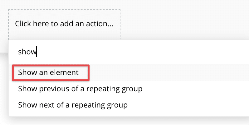
Popups, as the name suggests, are Groups that display over all other elements on your page. They’re typically used to display a message (“Are you sure you want to log out?”), but you can use it for whatever you need. Popups are not visible until you till Bubble to show it with the Show an element action in a workflow.
Just like regular Groups, Popups can contain any kind of data you want to be referenced by its child elements. But there are some key differences:
- Popups are above other elements on the Z axis (meaning that if your screen was a 3d space, they would float “above” everything else). This means they don’t affect the layout of the rest of your app in any way (like Groups with collapsing height would)
- You can use popups to black out or blur the screen partially or completely, only showing the content of the popup
- Popups have limited responsiveness: they won’t stretch on a bigger screen, but you can control its shrinking (or set it to fixed width)
Floating Groups
Floating Groups are similar to regular Groups, but with one clear distinction: they can be locked to a specific part of the screen even if the user scrolls. In other words, they’re great for bars and menus that you want to stick to the top, bottom or side of the screen and remain there.
A great example is Bubble’s own homepage (which is built on Bubble). The menu bar sticks to the top of the screen as the user scrolls, giving continual access to it.

Floating Groups can be used in creative was to set up more than just top bars. The setting below would freeze the group relative to the bottom left.
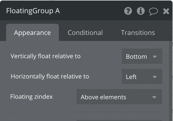
This could be used to have elements float away from the edge, but remaining frozen in the same place, like this + button typically seen in Android apps:

Group Focus
The Group Focus is similar to the Floating Group, but with some key differences. First, the Group focus can be rendered relative to an element on the screen. Secondly, as the name suggests, the Group will hide as soon as it loses focus (you click somewhere outside of it).
Let’s start with the first point: this means that if you want to show a group next to a button that is clicked, you can use the Group Focus and show it at specific coordinates relative to that button. This is great for things such as dropdown menus. The second point means that the Group is only visible for as long as it doesn’t lose focus. If you click somewhere else on the screen, it will instantly go invisible.

The Group Focus is a great element to use in cases like the one above. But there are a few drawbacks worth noting: first, the group is not responsive, meaning its size is fixed no matter what. In most cases, this is not a problem, but if you’re using it in a case like the one below, this can be a challenge.
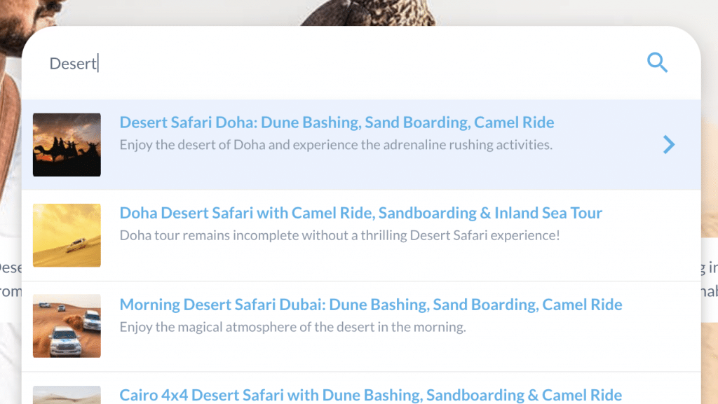
In this case we’re experimenting a bit with the use of Group Focus. The challenge here is that the Group Focus showing the search results is bound to the search input field. If we allow the search field to shrink or grow as the screen width changes, the Group Focus will not change size with it, making it look unprofessional. In this case, we’re forced to set a fixed width on the search input to avoid that problem.
How the number of elements affect your app performance
As a final note, it’s worth keeping in mind that the more elements you add to your page, the slower your app will become. This includes any group that you choose to add. It’s best practice to not add Groups unnecessarily to keep the total number of elements as low as possible. As always, that doesn’t mean you should shy away from using Groups altogether – they’re highly useful and often necessary – just to not go nuts and set up groups within groups just for the sake of it. Less is more. You can ready why, and lots of other performance tips in our book The Ultimate Guide to Bubble Performance. If you’re new to Bubble, you may also be interested in our in-depth Bubble review.
Let me know in the comments if you have questions or you think I’ve left out something important!


